
Guidelines for Posters
There is no right layout. Most often posters are made in landscape format (e.g., 36 inches high and 48 inches wide) but confirm what your conference or event prefers. Many more conferences now require portrait layouts (e.g., 48 inches high and 36 inches wide).
The most conventional format is a 3 column layout where the left-hand column is the introduction and methods, the middle contains the results, and the right-hand column has conclusions, references, and acknowledgements.
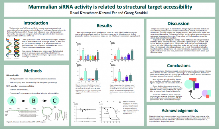
Source:
This layout doesn’t work for everyone. See How to Make a Poster for more layout options.
Some things to think about when choosing a layout…
- Sections should be arranged in a logical order. We typically read left to right and top to bottom.
- You can also use arrows or other visuals to guide the reader.
- Center the most important things and make them really big. In the sciences important graphs or images often make up the central focal point. But if you do not have these, having different statements or your main takeaway point can also be your focal point.
Contact Us
Center for the Support of Undergraduate Research & Fellowships
King Hall 2nd Floor